Professional Portfolio Project Walkthrough
July - September 2020
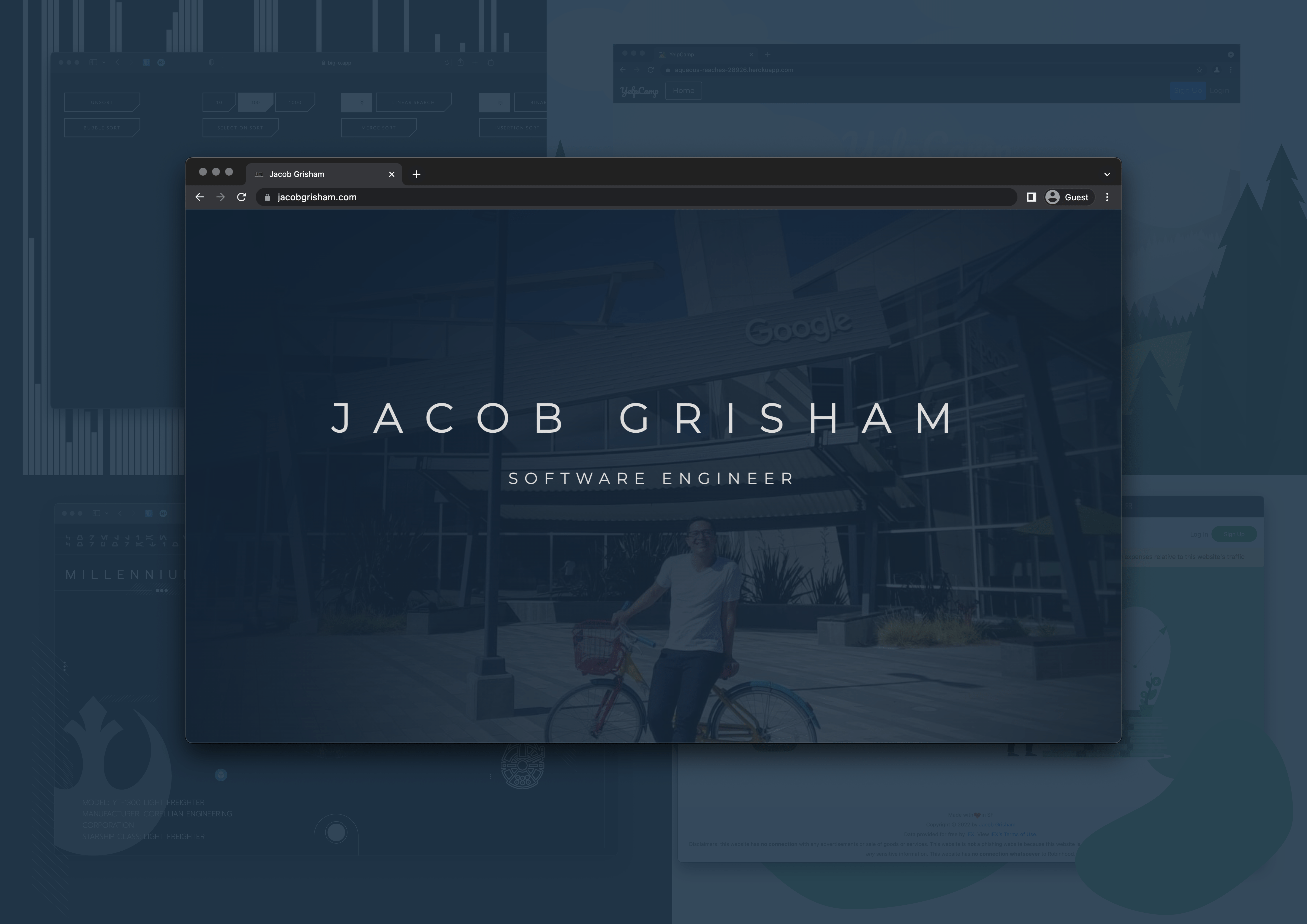
Source Code
About
My portfolio fundamentally revolves around my other projects. Focused on showcasing a select few with high-quality standards. The core of the application was built from December 2020 - January 2021, with sporadic updates up until January 2023.
Product Features and Specifications
- Custom loading page animation for home page and project pages. Animation is supposed to simulate a developer writing code in an Integrated Development Environment on a MacBook Pro. Art style is a cross between graphic design and illustration to abstract away unnecessary details.
- For projects that leveraged AdobeXD for wireframing or prototyping, embedded an interactive AdobeXD on the webpage. Furthermore, positioned the iframe over a hyper-realistic SVG image of an iPhone and MacBook Pro to further simulate the experience of interacting with the content in its native device.
- For full-stack projects, created diagrams of code architecture, database schema, and production system architecture with draw.io.
Technologies
Front-End
- HTML5
- Sass
- Javascript ES6+
- jQuery
Testing
- Google Lighthouse
Development
- Git
- GitHub
- Codacy
- CodeClimate
Production
- Netlify
- Google Domains
- Google Analytics
UX/UI Mocks and Graphic Design
Used open-souce SVG assets from simpleicons and from icomoon and placed them all in a sprite.svg file from the symbol-defs.svg file.
Admittedly, I initially mocked this website in a physical notebook. Looking back, given how simple the initial design was, I think this is still appropriate, especially considering that I didn't have to share the mock with any teammates. At this point, it's quaint and nostalgic to think of mocking a website on the proverbial backside of a napkin.
Design and Architecture
Code Architecture
Initially built this website with a backend server using ExpressJS as the Node.js application framework, which was primarily used for serving the single page and for setting HTTP headers and Content Security Policy. I chose ExpressJS as the Node.js application framework for its simple, lightweight functionality. Furthermore I chose to use it to gain more practice because some companies still use it. When this application had a backend, I had to host it somewhere, so I chose to host it on Heroku due to the simplicity of Heroku as a Platform as a Service (PaaS) solution. At one point, the website was hosted on the Hobby (paid) plan on Heroku to guarantee site reliability uptime. The main problem with this overall approach was that it was both heavy and expensive. It was heavy in that ExpressJS wasn't strictly neccessary just to serve a single page. It was expensive in that the Hobby plan was $7 per month. Therefore, after learning about the Jamstack, I refactored this application by migrating from a server-based architecture with ExpressJS to a static website architecture with simple HTML. I switched cloud-hosting providers from Heroku to Netlify. The code is more simple and efficient, the website has better performance, and the cloud-hosting provider is free.
Initially utilized a one-page layout to force creativity in front-end capabilities. In particular, the information in the project pages used to be available only through a modal popup. This certainly forced some implementation creativity for the front-end. However, when I had ideas for making the project pages more content-rich and even interactive, the little modal window started to prove to be a bottleneck. Furthermore, the Google web crawler was not able to index the crucial information in the modal because in the implementation, I had to set the display to none in order to hide it until a user clicked on a button to show it.
Instead of using a CSS framework like Boostrap, I created all the CSS features from scratch for greater control and customization. I chose to use Sass as the CSS superscript for a few reasons. One was to facilitate using BEM notation. More importantly though, using Sass has a few more useful features than plain CSS, such as the ability to use a @mixin. I also chose Sass because at the time I was unaware of native CSS variables. Regarding the display, I employed a combination of CSS float, flex, and grid properties to gain practice with using each of these approaches. I ensured that the entire website was responsive and used a desktop-first construction methodology. Looking back, I would use a mobile-first construction methodology instead to slightly decrease load time. Optimized responsive design for 8 screen sizes largely following the Google Chrome default screen size breakpoints (4K, LaptopL, Laptop, Tablet, Mobile L, Mobile M, Mobile S). At the time I wasn't aware of other options for choosing screen size breakpoints, so I just went with what Google Chrome provides in the Developer Tools. Implemented responsive design with media queries.
Increased Google Lighthouse performance score from 12 to 88 and decreased DOM Content Loaded time from 10s to 2s using intersection observer and lazy loading for images and video. Then decreased first visit DOM Content Loaded time from 7s to 1s by refactoring the website from using an express.js server to a static site with no web server.
Production System Architecture
There are currently two separate code repositories, deployment pipelines, and web domains. One for this website, my portfolio, and another for my blog. Both repos use different technology stacks that weren't integrating well with one another, so I isolated my blog and just linked them together with a tags. When I initially created this portfolio, it was at the start of my software engineering journey, indeed I built the core of this website approximately 2 months into learning web development for the first time. So I built this website with raw HTML and only used Sass as an abstraction on top of CSS. When I created my blog, I was 3 years into my software engineering journey, so I had the benefit of experience to choose a tech stack like Gatsby with React for the blog. Integrating Gatsby, particularly this specific blog template, with raw HTML was a good challenge, however after a certain point, I felt I was straying away from the core problem, starting a blog in the first place. Therefore, I decided to keep both the code and production system architectures separate. I have plans of building out a new, better portfolio website with React in the future, at which point I'l be able to integrate my portfolio and blog under one codebase, one deployment pipeline, and ultimately one domain. But for now, this overall strategy helps to remove the friction with starting a blog.

Production System Cost
- Netlify Starter Plan: free
- Google Domain for jacobgrisham.com and jacobgrisham.dev: $26/year
- GitHub Free Tier: free
Production Metrics
- Traffic: 300+ total website visits since launch
- Search Engine Optimization (SEO): achieved Google PageRank #1 for the search term “jacob grisham”
- Site Reliability: 100% uptime service-level indicator (SLI)
- Security: Increased Mozilla Observatory security grade from ‘F’ to ‘B-’ using HTTP Headers, HSTS, and Content Security Policy
- Performance: from Google Lighthouse
- Accessibility: from Google Lighthouse
- Cross-Browser Compatibility: used LambdaTest to automatically test this website on different browsers (Chrome, Firefox, Sarfari, and Microsoft Edge) and for different versions of those browsers
Lessons Learned
- Performance, Security, Accessibility, and SEO optimization with Lighthouse. Increased Google Lighthouse performance score from 12 to 88
- Decreased average DOM Content Loaded time from 10s to 2s using intersection observer and lazy loading for images and video. Further decreased first visit DOM Content Loaded time from 7s to 1s by refactoring website from using an express.js server to a static site with no web server
- Increased SEO to achieve Google PageRank #1 for the search term “jacob grisham”. Used Open Graph Meta Properties (og:image, etc.) to help increase ranking
- User Experience optimization with loading page SVG animation
- Increased cross-browser compatibility using LambdaTest
- First time using Google Analytics and first time routing website to a domain name